News | January 13, 2013
Landsat senses a disturbance in the forest
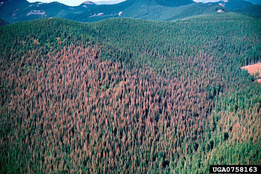
Aerial photograph of western spruce budworm outbreak at Mount Hood National Forest, Oregon. Credit: William M. Ciesla, Forest Health Management International, Bugwood.org (source and image policy)
By Ellen Gray,
NASA's Goddard Space Flight Center
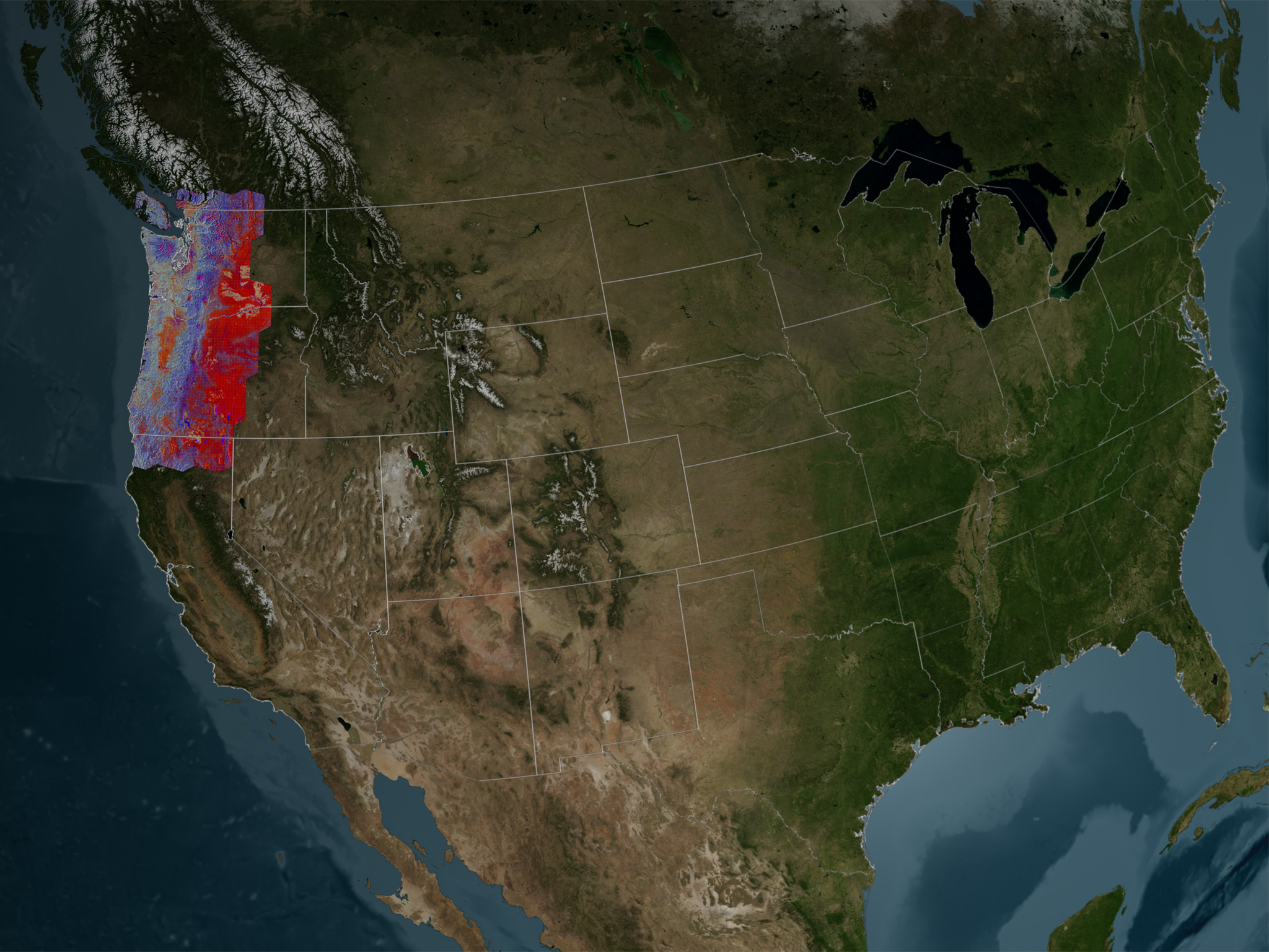 This imagery covers lands managed by the U.S. Forest Service in Washington state, Oregon and northern California. Credit: Goddard's Scientific Visualization Studio
Called LandTrendr, this computer program is able to find patterns previously buried within vast amounts of scientific data. Still in development, it's already led to seeing for the first time in satellite imagery an obscured, slow-moving decline and recovery of trees in Pacific Northwest forests.
The unexpected disturbance pattern showed a long slow decline of tree health over years followed by slow regrowth. It emerged in several areas, particularly near Mount Hood in the 1980s, peaking in 1992 when regrowth began, and near Mount Rainier where the insect outbreak lasted ten years from its onset in 1994 till the insects killed all the trees and moved on in 2004.
Kennedy created the LandTrendr program specifically to work with data from the NASA and U.S. Geological Survey (USGS) Landsat program. Kennedy's new way of viewing Landsat imagery has already changed how the Forest Service in the Pacific Northwest operates its yearly forest monitoring program that uses ground stations, satellite imagery and statistics to evaluate current conditions.
Kennedy says that LandTrendr works because of the unique nature of Landsat data. The data embedded in images are a scientific record of the Earth's surface that goes back 40 years. Each image, or scene, covers an area 115 miles by 112 miles (185 kilometers by 180 kilometers) and provides data for wavelengths of light reflected or emitted from the Earth's surface, which scientists use to see, for example, forest conditions not apparent in visible light. With the four-decade record, they can compare images between years and see how the land changes with time.
Studying big areas over many years means handling big data sets and figuring out how to get all the data to work together for meaningful comparisons. One challenge in particular is finding images from the same time of year where the view of the ground is not hidden by clouds.
Kennedy's breakthrough was to combine cloud-free pixels from multiple scenes of the same area collected over the growing season in late summer. Then he compares the new images for each year to one another. By breaking a scene down into smaller sized pixels, the cloud-covered portions could be tossed away, but LandTrendr keeps the clean bits to reveal the life history of each pixel.
"We're getting better data use out of what people think of as crummier images," says Curtis Woodcock, a remote sensing specialist at Boston University who employs a similar method to Kennedy to build an image of the landscape out of Landsat data pixel by pixel.
What makes all this possible are two things: Computers are finally powerful enough to process vast amounts of data, and Landsat data is now available free of charge.
The Oregon data trail
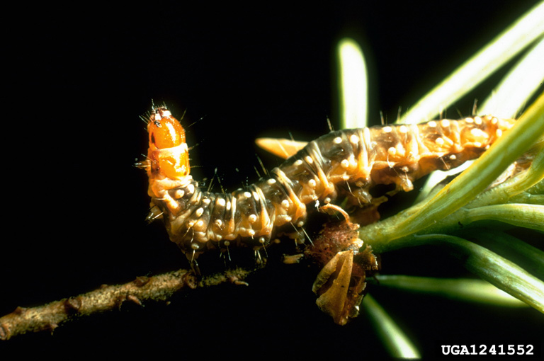 Western spruce budworms are inactive in the winter and feed on needles of coniferous trees as mature larvae beginning in May or June. In July and August, they pupate into adult moths. Credit: Scott Tunnock, USDA Forest Service, Bugwood.org (source and image policy)
"Not that long ago the size of an individual Landsat scene would have crippled most desk top computers," says Doug Morton, a physical scientist at NASA's Goddard Space Flight Center in Greenbelt Md., who uses Landsat to study changes in the Amazon and forests in Indonesia. Now with processing power doubled or more, he says, it's no problem for most desktop machines to handle a big scientific job.
When Kennedy first saw a yearly succession of moderate resolution Landsat satellite images of a 13,000 square mile area near Portland, Ore., it was a revelation. Says Kennedy, it was like looking at a pair of air photos of a forested hillside offset so that with special glasses, the image pops into three dimensional clarity. "You sort of squint your eyes and it takes a while and all of a sudden you get that moment -- boom! Oh, my god, it's a landscape!" he says. "I had that same sense [of amazement ] when I first started looking at the time series stuff."
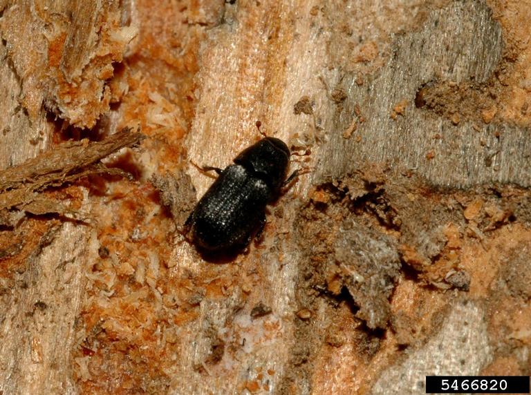 Mountain pine beetles bore into trees to lay their eggs under the bark. They introduce a fungus that prevents the tree from defending against the attack and stops water and nutrient transport within the tree. Credit: William M. Ciesla, Forest Health Management International, Bugwood.org (source and image policy)
"We did not expect that," says Kennedy. In the satellite imagery they had found two kinds of insect signals. The first is a classic mountain pine beetle outbreak. One near the Three Sisters volcanoes in Oregon started in the late 1990s and early 2000s. The beetles attacked lodge pole pines, the same species affected in outbreaks throughout British Columbia and Colorado.
The second, subtler signal found near Mount Hood and Mount Rainier is the western spruce budworm, an insect that moves into an area and eats the needles off the trees. Losing its green growth doesn't necessarily kill the tree, but it does put it under a lot of stress. If budworms return in following years, trees will ultimately succumb to the onslaught and die. Then the budworms, out of food, move on. And the forest gradually recovers.
Kennedy says to confirm the satellite data, they hiked into areas with recent known budworm outbreaks near Mount Rainier. With the decline and regrowth patterns from the new maps in hand, Kennedy says, "we stand out on the ground in the forest and look at all the dead trees and we realize that we're actually starting to see something that we had never been able to see before from space. It was very exciting."
"That ability to read the story of the landscape is something that the Landsat archive allows us to do like none other," says Doug Morton of NASA Goddard. NASA and the USGS will continue providing the means to see it with the next satellite in the Landsat series, to be called Landsat 8, scheduled to launch in early 2013.
To learn more about the Landsat program, visit:
http://www.nasa.gov/landsat
http://landsat.usgs.gov


