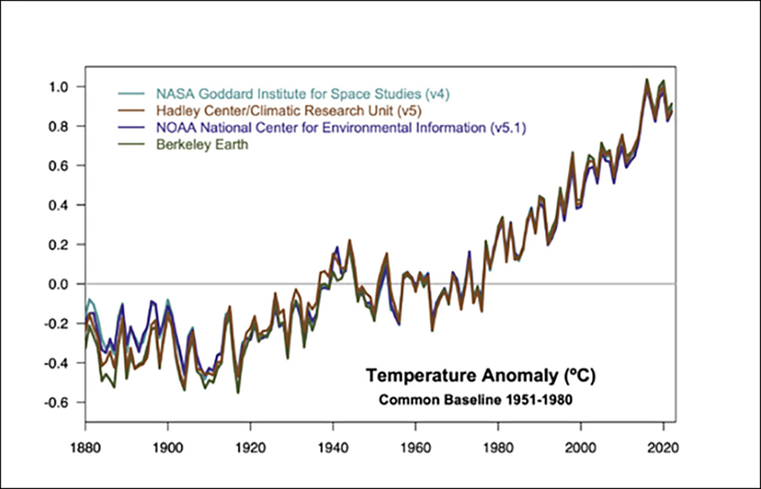
Why does the temperature record shown on your “Vital Signs” page begin at 1880?

Three of the world’s most complete temperature tracking records, maintained by NASA’s Goddard Institute for Space Studies, the National Oceanic and Atmospheric Administration’s National Climactic Data Center and the UK Meteorological Office’s Hadley Centre, begin in 1880. The oldest continuous temperature record is the Central England Temperature Data Series, which began in 1659, and the Hadley Centre has some measurements beginning in 1850, but there are too few data before 1880 for scientists to estimate average temperatures for the entire planet. To compensate for the lack of direct temperature data, scientists rely on reconstructed data from proxy records, such as tree rings, pollen counts, and ice cores. Because these proxy records differ fundamentally from direct measurements, scientists typically do not include them on the same charts as the "instrumental record."
The agencies mentioned above and others collect temperature data from thousands of weather stations worldwide, including over the ocean, in Antarctica, and from satellites. However, it's important to note that temperature measurement instruments were not evenly distributed across the globe, and some measurement sites have changed, like deforestation or urbanization, since 1880. These changes affect nearby temperature readings. Each agency employs algorithms to account for and mitigate the effects of these changes in the temperature record. Additionally, when data are sparse, especially over the vast Southern Ocean, these agencies use interpolation methods to estimate temperatures.
In general, all four datasets agree quite closely (see graph above) and are in agreement on the global warming trend since the Industrial Revolution.
READ MORE


