News | February 22, 2015
Why so many global temperature records?
If you follow Earth and climate science closely, you may have noticed that the media is abuzz every December and January with stories about how the past year ranked in terms of global temperatures. Was this the hottest year on record? In fact, it was. The Japanese Meteorological Agency released data on January 5, 2015, that showed 2014 was the warmest year on its record. NASA and NOAA made a similar announcement on January 16. The UK Met Office, which maintains the fourth major global temperature record, ranked 2014 as tied with 2010 for being the hottest year on record on January 26.
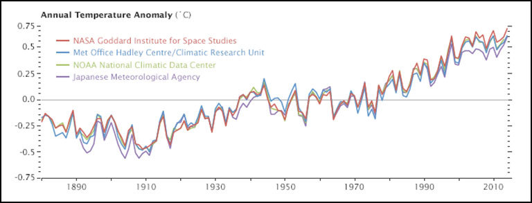
Astute readers then ask a deeper question: why do different institutions come up with slightly different numbers for the same planet? Although all four science institutions have strong similarities in how they track and analyze temperatures, there are subtle differences. As shown in the chart above, the NASA record tends to run slightly higher than the Japanese record, while the Met Office and NOAA records are usually in the middle.
There are good reasons for these differences, small as they are. Getting an accurate measurement of air temperature across the entire planet is not simple. Ideally, scientists would like to have thousands of standardized weather stations spaced evenly all around Earth’s surface. The trouble is that while there are plenty of weather stations on land, there are some pretty big gaps over the oceans, the polar regions, and even parts of Africa and South America.
The four research groups mentioned above deal with those gaps in slightly different ways. The Japanese group leaves areas without plenty of temperature stations out of their analysis, so its analysis covers about 85 percent of the globe. The Met Office makes similar choices, meaning its record covers about 86 percent of Earth’s surface. NOAA takes a different approach to the gaps, using nearby stations to interpolate temperatures in some areas that lack stations, giving the NOAA analysis 93 percent coverage of the globe. The group at NASA interpolates even more aggressively—areas with gaps are interpolated from the nearest station up to 1,200 kilometers away—and offers 99 percent coverage.

If you’re a real data hound, you may have heard about other institutions that maintain global temperature records. In the last few years, a group at UC Berkeley—a group that was initially skeptical of the findings of the other groups—developed yet another approach that involved using data from even more temperature stations (37,000 stations as opposed to the 5,000-7,000 used by the other groups). For 2014, the Berkeley group came to the same conclusion: the past year was the warmest year on record, though their analysis has 2014 in a virtual tie with 2005 and 2010.
Rather than coming up with a way to fill the gaps, a few other groups have tried using a completely different approach. A group from the University of Alabama-Huntsville maintains a record of temperatures based on microwave sounders on satellites. The satellite-based record dates back 36 years, and the University of Alabama group has ranked 2014 as the third warmest on that record, though only by a very small margin. Another research group from Remote Sensing Systems maintains a similar record based on microwave sounders on satellites, although there are a few differences in the way the Remote Sensing Systems and University of Alabama teams handle gaps in the record and correct for differences between sensors. Remote Sensing Systems has 2014 as the 6th warmest on its record.
But let’s get back to the original question: why are there so many temperature records? One of the hallmarks of good science is that observations should be independently confirmed by separate research groups using separate methods when possible. And in the case of global temperatures, that’s exactly what is happening. Despite some differences in the year-to-year rankings, the trends observed by all the groups are roughly the same. They all show warming. They all find the most recent decade to be warmer than previous decades.
You may observe some hand-wringing and contrarian arguments about how one group’s ranking is slightly different than another and about how scientists cannot agree on the “hottest year” or the temperature trend. Before you get caught up in that, know this: the difference between the hottest and the second hottest or the 10th hottest and 11th hottest year on any of these records is vanishingly small. The more carefully you look at graph at the top of this page, the more you’ll start to appreciate that the individual ranking of a given year hardly even matters. It’s the longer term trends that matter. And, as you can see in that chart, all of the records are in remarkably good agreement.
That said, if you are still interested in the minutia of how these these data sets are compiled and analyzed, as well as how they compare to one other, wade through the links below. Some of the sites will even explain how you can access the data and calculate the trends yourself.
- UCAR’s Global Temperature Data Sets Overview and Comparison page.
- NASA GISS’s GISTEMP and FAQ page.
- NOAA’s Global Temperature Analysis page.
- Met Office’s Hadley Center Temperature page.
- Japan Meteorological Agency’s Global Average Surface Temperature Anomalies page.
- University of Alabama Huntsville Temperature page.
- Remote Sensing Systems Climate Analysis, Upper Air Temperature, and The Recent
- Slowing in the Rise of Global Temperatures pages.
- Berkley Earth’s Data Overview page.
- Moyhu’s list of climate data portals.
- Skeptical Science’s Comparing All the Temperature Records, The Japan Meteorological Agency Temperature Records, Satellite Measurements of the Warming in the Troposphere, GISTEMP: Cool or Uncool, and Temperature Trend Calculator posts.
- Tamino’s Comparing Temperature Data Sets post.
- NOAA/NASA 2014 Warmest Year on Record powerpoint.
- James Hansen’s Global Temperature in 2014 and 2015 update posted on his Columbia University page.
- The Carbon Brief’s How Do Scientists Measure Global Temperature?
- Yale’s A Deeper Look: 2014’s Warming Record and the Continued Trend Upwards post.


