Ask NASA Climate | January 10, 2010, 16:00 PST
Waves in the bathtub
Why sea level rise isn’t level at all

From Dr. Josh Willis, NASA/Jet Propulsion Laboratory oceanographer

This famous climate scientist I know used to always begin his talks on sea level rise by showing a cartoon of a bathtub. A faucet would fill up the bathtub, representing water coming from melting glaciers and ice sheets, and then a small campfire would add heat, causing the water to expand. It was a nice way of getting people to think about the causes of sea level rise. But you might guess that the real ocean is a bit more complicated than the cartoon lets on. And you’d be right. Even though it’s sometimes convenient to think of the ocean as a great big bathtub, where turning on the tap at one end raises the water level in the whole tub, real sea level rise doesn’t quite happen that way. To understand why, you first have to realize that ‘sea level’ isn’t really level at all.
There are lots of reasons why the oceans are not level. For example, vast ocean currents like the Gulf Stream in the Atlantic Ocean and the Kuroshio in the Pacific actually reshape the ocean surface, causing it to tilt. As the planet heats up, changes in the prevailing winds (which drive most of these ocean currents) cause changes in the currents, reshaping our ocean and changing local sea level as a result.
Just as global warming does not raise land temperatures evenly, global ocean warming is not the same everywhere around the globe. Some regions of the oceans are heating up faster than others, and because warm water takes up more space than cold water, those regions experience faster sea level rise.
Finally, the water locked away in the great ice sheets of Greenland and Antarctica also shapes the ocean surface. As the ice sheets melt and lose water to the oceans, our entire planet feels the effects. The movement of mass from the ice sheets to the oceans very slightly shifts the direction of Earth’s rotation. This, along with changes in the gravitational pull of the ice sheets on the oceans, will reshape sea levels further still.
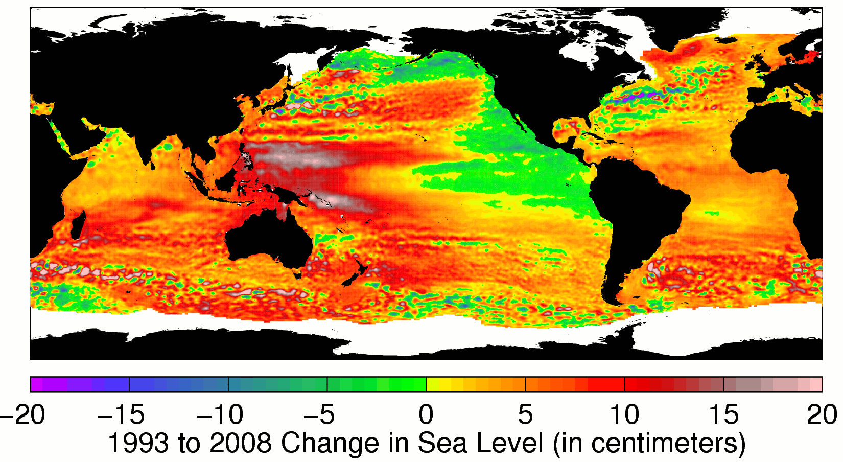
So sea level rise is complicated, and the bathtub analogy just doesn’t cut it. Given all that, the image below is not that surprising. It shows how sea levels changed between 1993 and 2008 (yellow and red show rising sea levels, blue and green show falling). Since the early 1990s, space satellites have given us a bird’s-eye view of sea level change. They tell us that that sea level, averaged over the whole planet, has gone up by about 4.5 cm (1.8 inches) since 1993 — clear evidence of global warming. (To recap: global warming causes a) ocean water to warm up, expand, and take up more space; and b) glaciers to melt which add more water to the oceans.) But the patterns of sea level change tell a much more complicated story.
Most of the regional variations seen over this 16-year trend are related to changes in the ocean currents rather than the movement or melting of ice. Australia for example, where 80% of the population lives near the coast, has seen sea levels rise much more quickly than the rest of the planet. Meanwhile, along the California coast, sea level has stayed steady or even fallen a bit.
The question is whether these regional differences are part of natural climate cycles, or an effect of global warming? The answer is probably both, and scientists around the world are working hard to tell the difference.
So where does all this leave my friend’s bathtub analogy? High and dry, of course.
Editor's note: If you're interested in how sea level is changing around the globe check out our Climate Time Machine and Sea Level Viewer.